Designing a Realistic 3D Sci-Fi Console
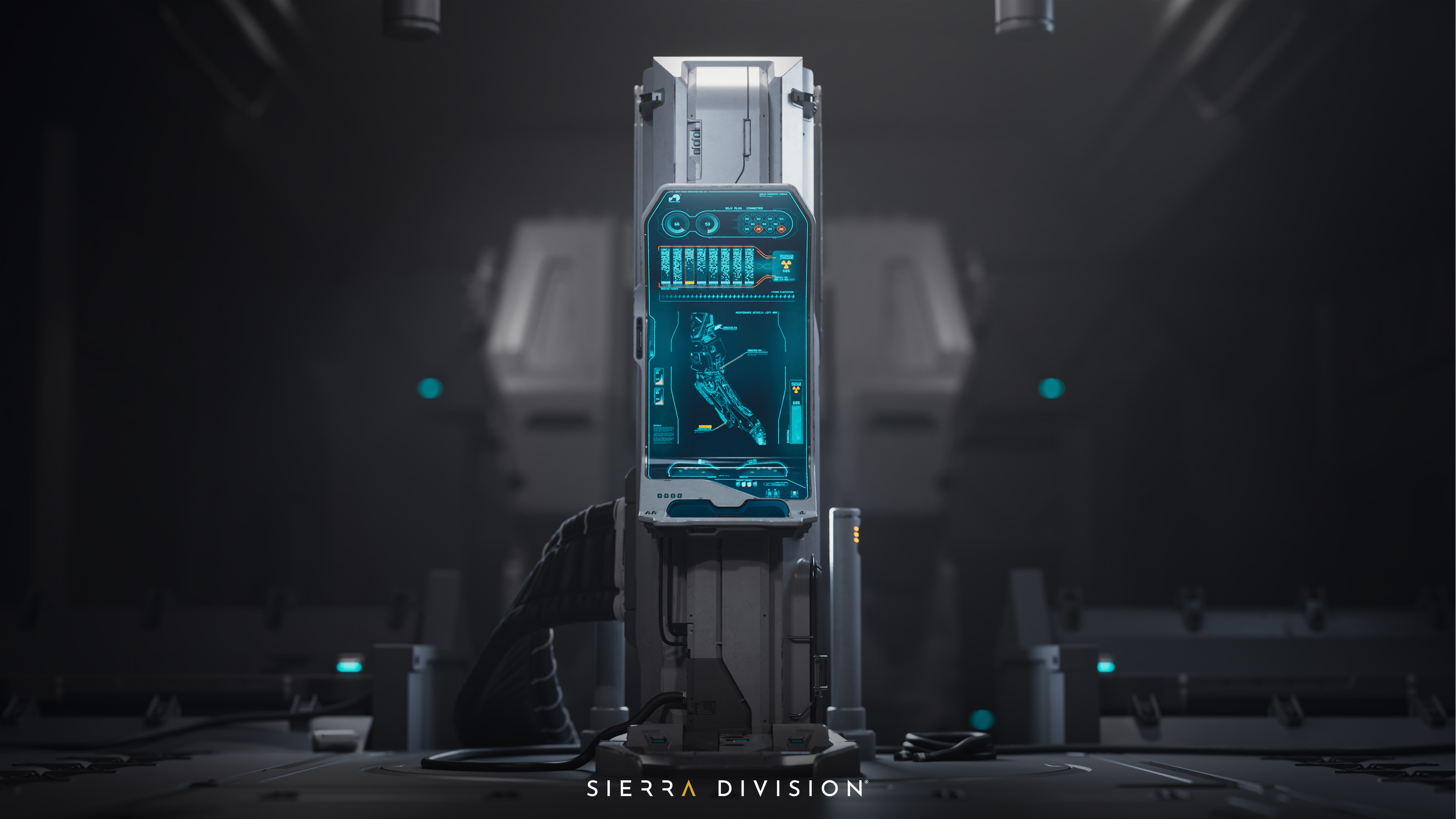

In this article, Sebastian Bielecki, Principal Environment Artist at Sierra Division, shares the inspiration, design process, and techniques behind the creation of the Sci-fi Mech Bay Control Console.
Find more of the art for the Sci-Fi Console on ArtStation.
What inspired the sci-fi console concept?
We wanted to enrich our portfolio with some sci-fi work. Hard surface modeling and design are somewhat different from other artworks that we have in our portfolio. We wanted to show clients that we can do sci-fi work and do it well! It’s something that a lot of us on the team really enjoy, actually, but we haven’t had as much opportunity to work on it as a studio. So we thought it was finally time!
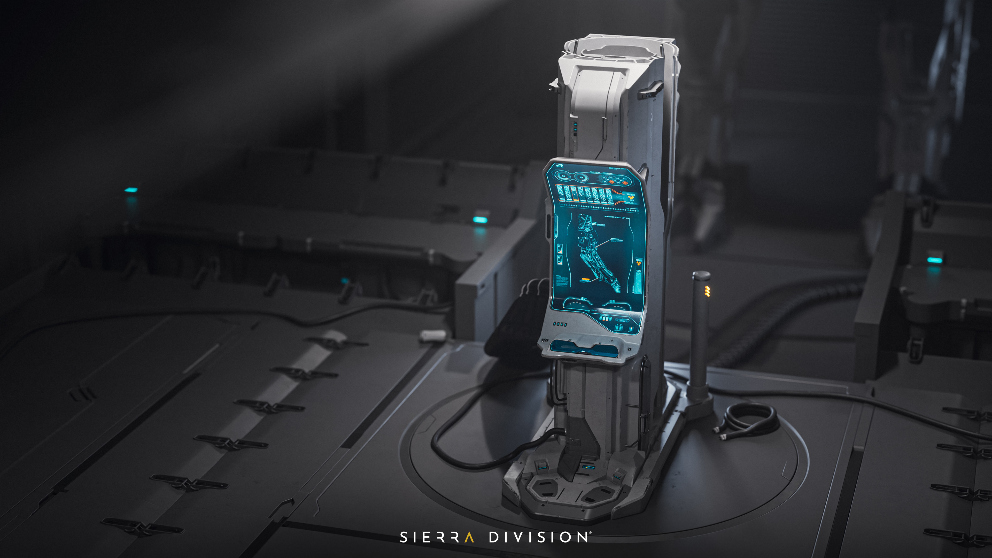
The console is part of a bigger environment project that will come in the near future. For now, the console is just a teaser that allows us to establish the shape language which will be used throughout the whole project.
How was the design phase approached?
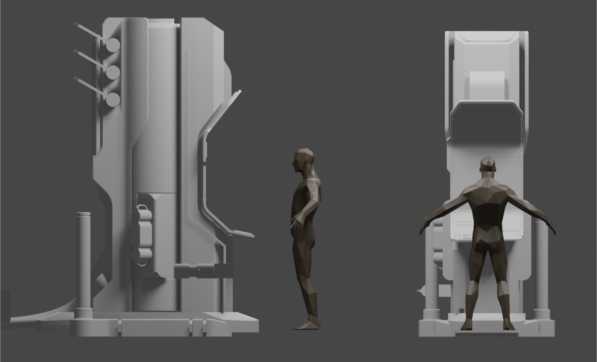
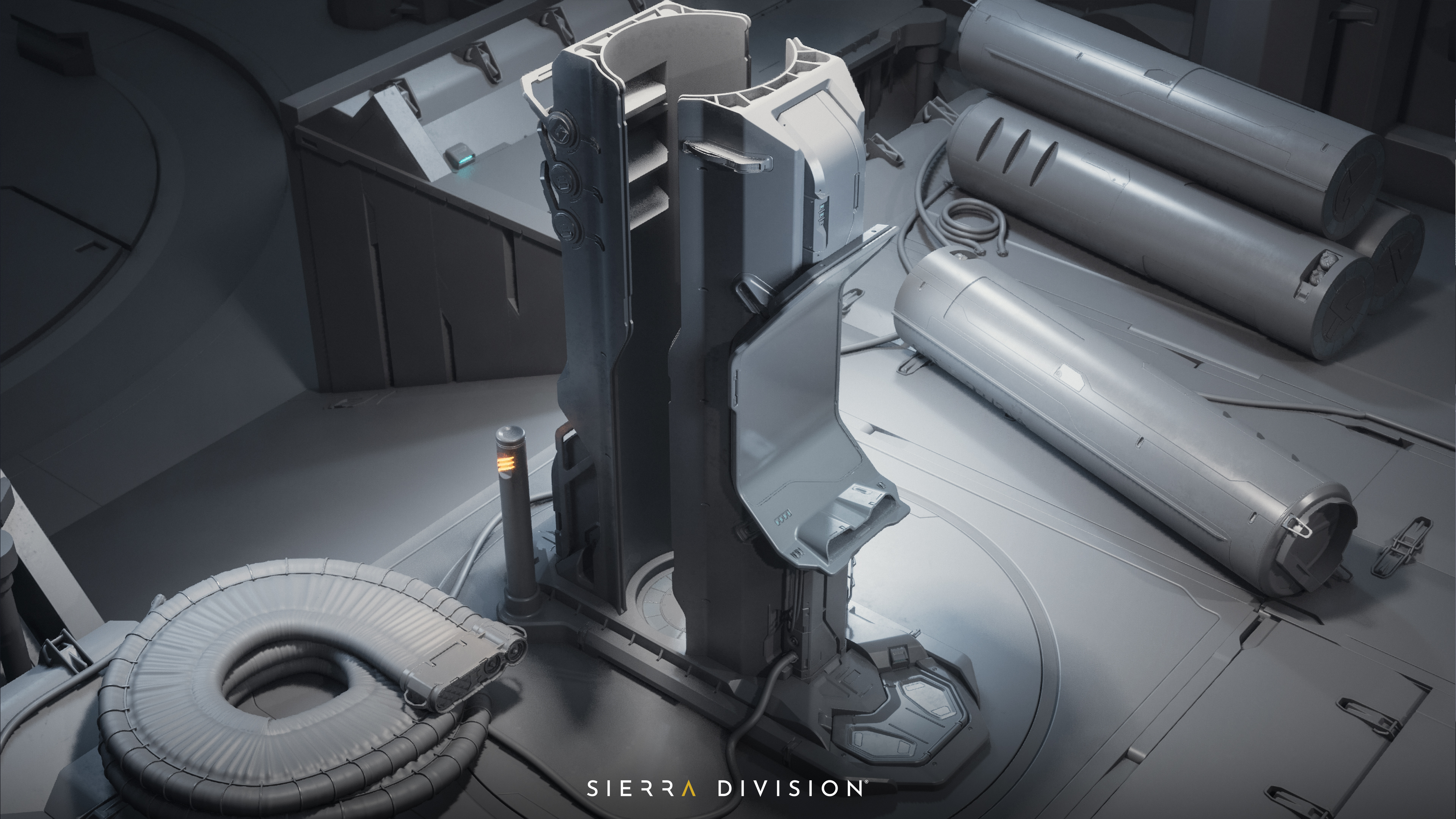
Design started from a brief of the environment and what props and assets it should include. We knew we wanted a console and charging station. With that in mind, we started by blocking silhouettes, some more, some less successful, until we locked in on a shape that worked for us. It had all the functional pieces that we needed, and it was designed as if it really could be found in the real world.
It's important to define clear limitations early on; where the asset needs to fit, what it must include, and how large it should be (human scale, in this case). These decisions should be established during the brief stage, and your design should work within those parameters.
Designing sci-fi is always challenging. You might think that you have unlimited possibilities because you can always make things up. On one hand, that looks like a perfect scenario, but without limitations it is very hard to design anything. Too many possibilities will only make you confused and make it hard to decide on something. Is this good? Maybe make it bigger, smaller, on the left, right, add more pieces of different shapes, etc. You might spend hours just running in circles without any decision taken.
What is the best approach for finding references for fictional sci-fi props and environments like this?
Finding clean sci-fi references is hard because you won't be able to find photos or images from the real world. They simply don't exist. When you do come across sci-fi images, someone has already processed them with their own style and ideas.
To achieve a compelling design and unique shape language, it's best not look too much for references to avoid copying someone else. Begin by looking for real-world objects and props, as well as color schemes and detail distribution. Consider how you can incorporate these elements into the prop you're designing. Focus on understanding the function and purpose first, and the rest will fill in the blanks.
Of course, you can look at other artists or artworks to help generate ideas, find inspiration for function or form, then put your own twist. I have a gigantic sci-fi pure ref board that I assembled over the years adding small bits to it. It is multipurpose when I look for inspiration. Sometimes it is great to even turn someone else's concept or artwork upside down and you can get something interesting.
What are your favorite sci-fi games/ films/ books and did they inspire you when creating this project?
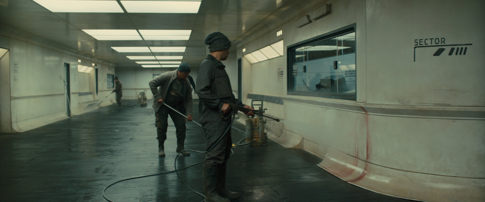
I’m a huge fan of Blade Runner, and the film was a strong inspiration for me. I love the simple yet dirty texturing, large empty surfaces with clusters of detail, and how the design is both futuristic and functional.
I also have a few of my favorite sci-fi artists that I look up to. For anyone looking for inspiration, the following artists are true masters of the craft (we’ll add links at the bottom of the Blog) Jan Urschel, Vitaly Bulgarov, Cki Vang, Alex Senechal, Andrian Luchian, Edon Guraziu, Sheng Lam, Mathieu Latour-Duhaime, Chris Doretz, Munkhjin Otgonbayar. I studied their designs on and off over the last few years and tried to establish a little bit of my own style, which also helped here.
What storytelling elements were important for the sci-fi console design?
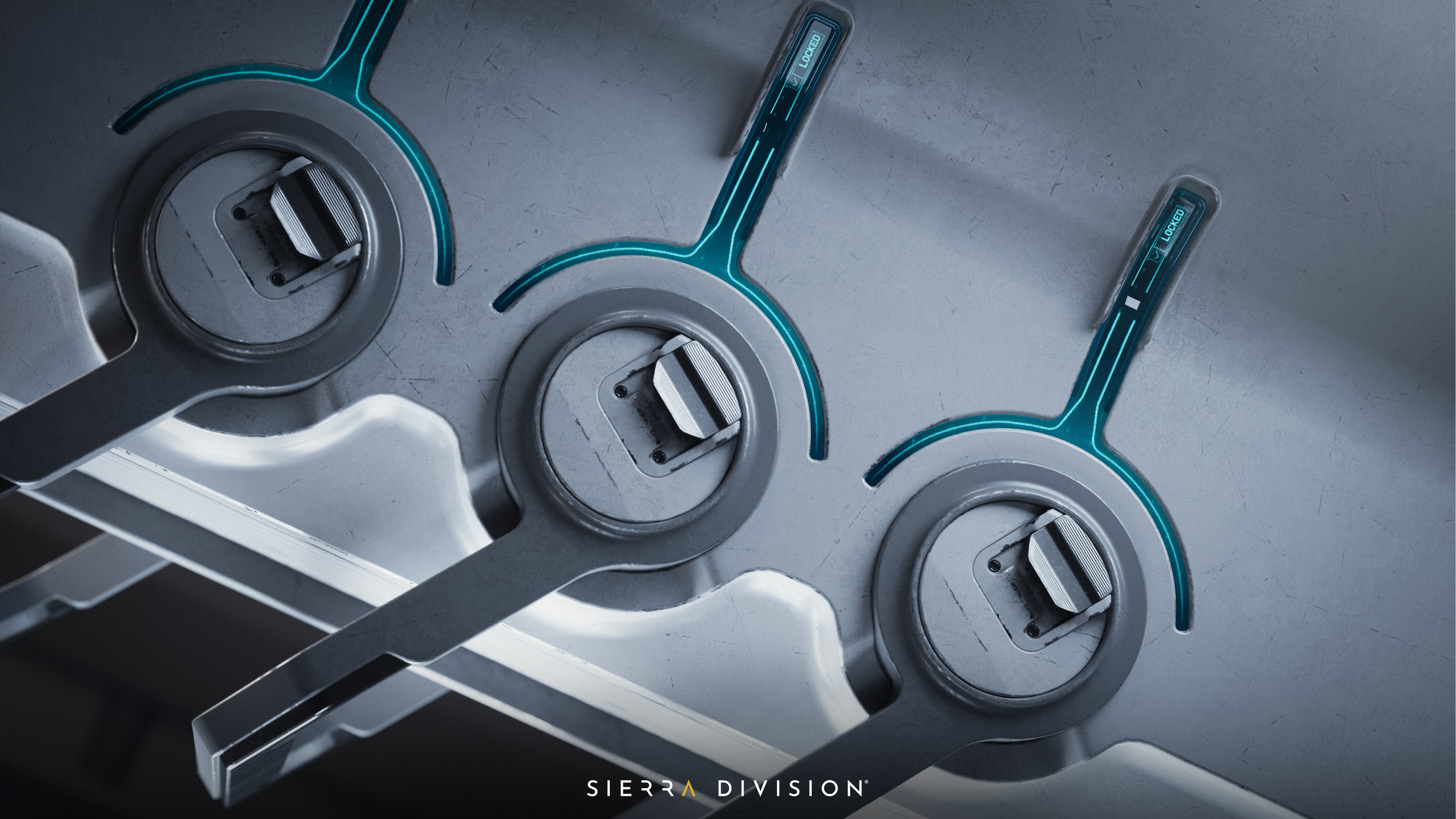
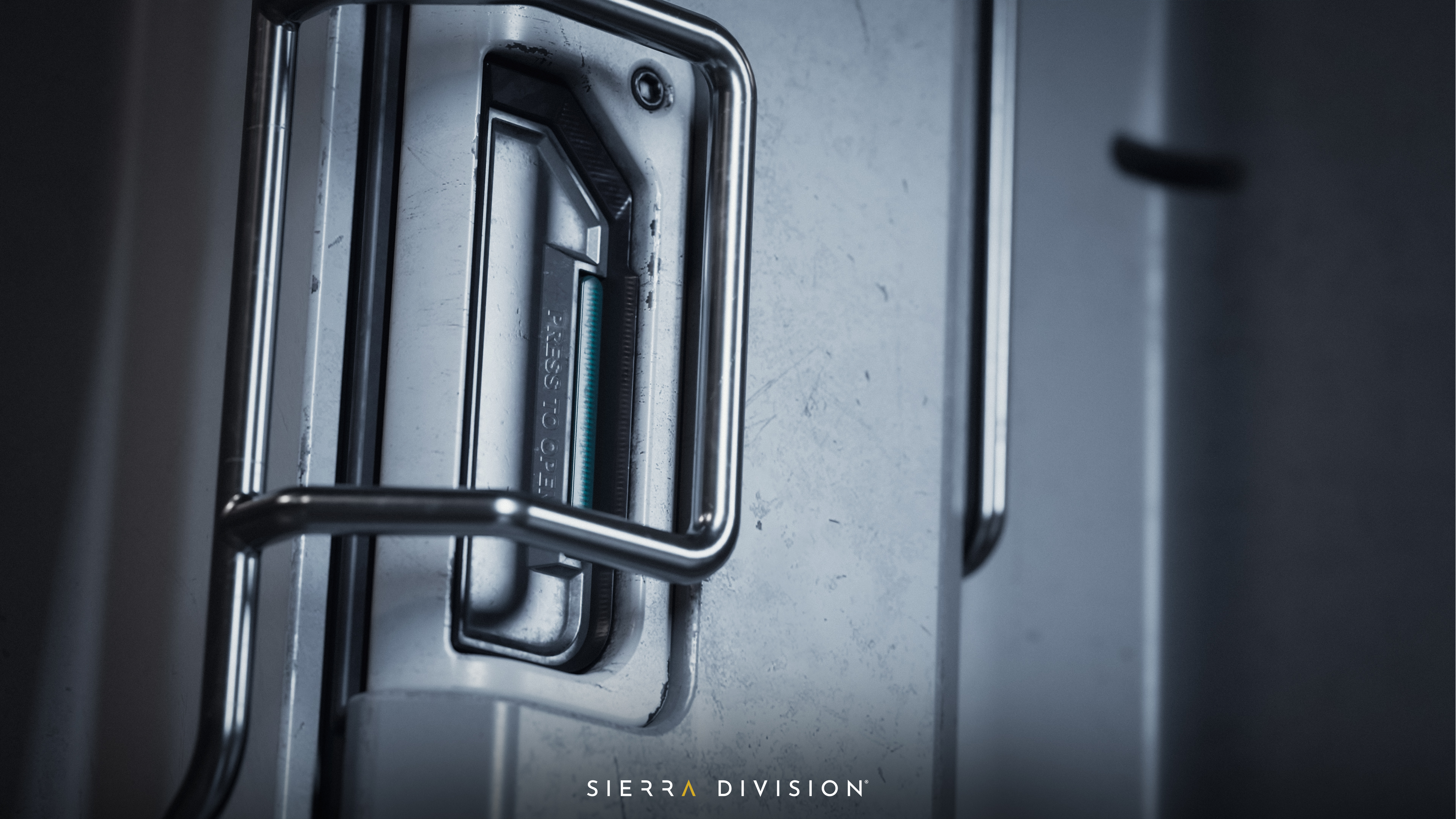
We aimed for the asset to appear realistic, as if it were from a futuristic IP. To achieve this, we focused on texturing and lighting, ensuring the edge wear and worn, dirty areas of the textures were placed accurately.
It was important to have the right proportions and to balance different areas of interest. We wanted to make something that could work in real life, so we carefully designed the console to look both realistic and functional.
The environment where the console is placed in the scene is temporary. The proper story of why and what the console was created for will come in the near future.
Texturing the console, and what tools or techniques helped achieve a realistic look:
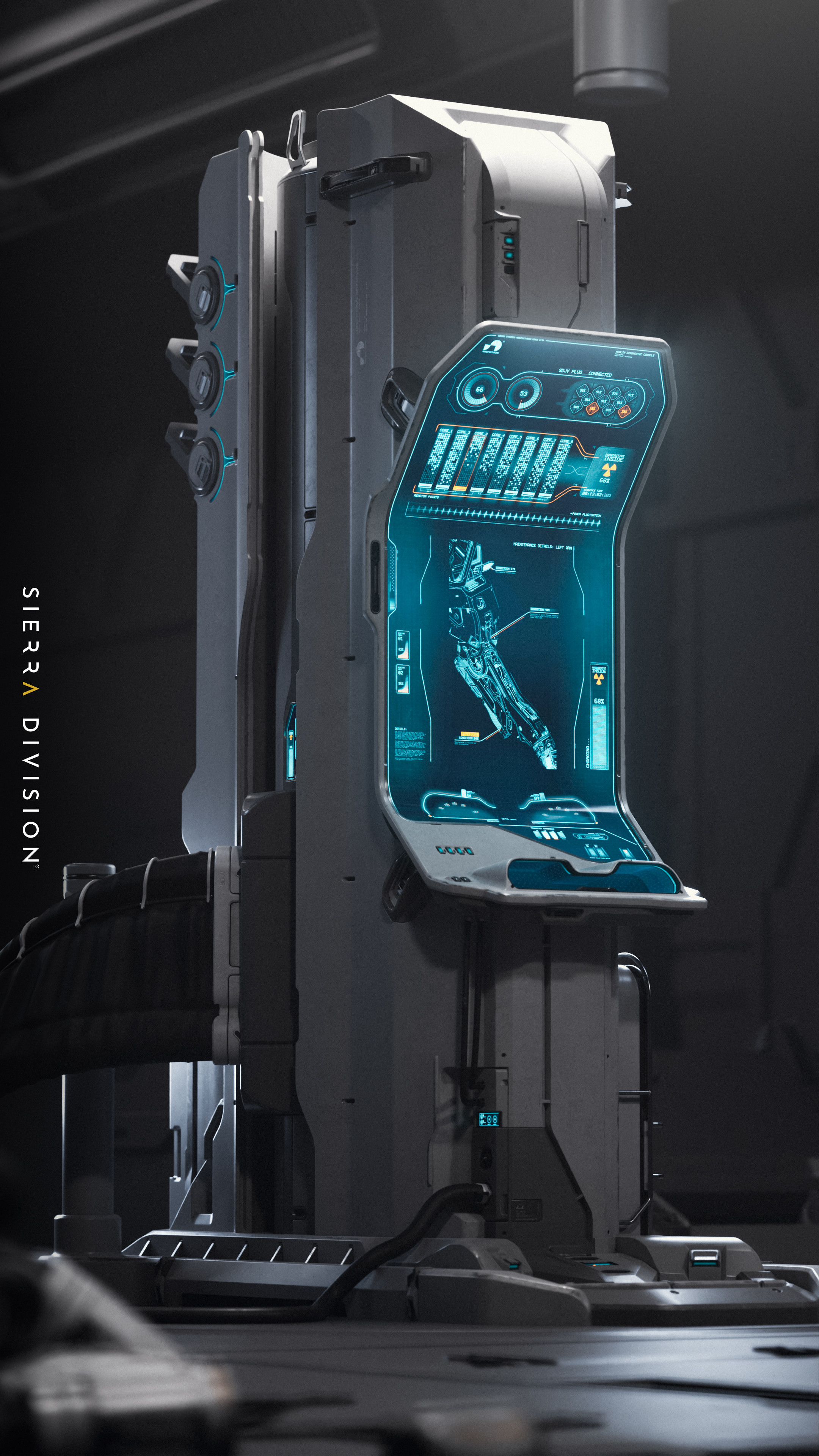
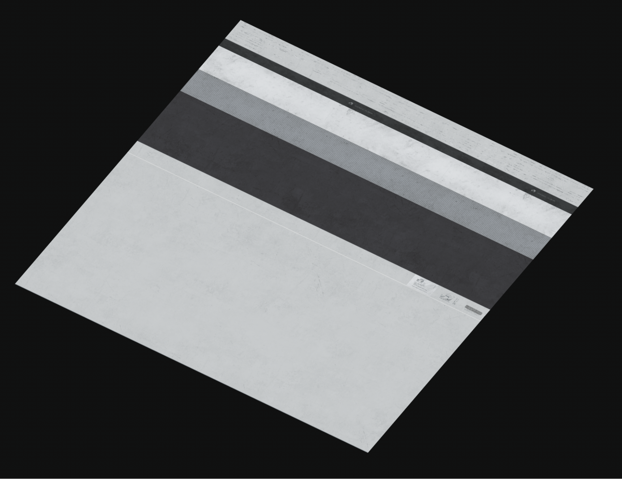
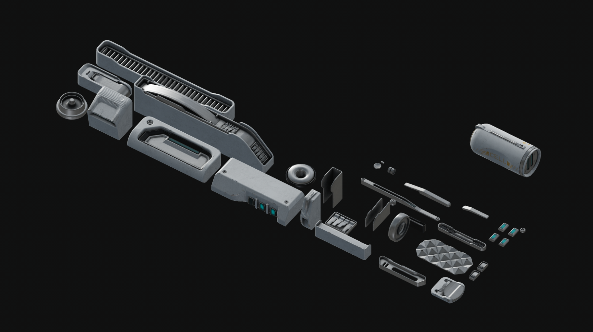
The console is too big to have custom texture, especially when we would try to maintain 13.65 Texel density. We had to use a mixture of custom texturing and trim sheets. Textures were done in Substance Painter and the rest of the magic (UVs/mapping) was done in Blender.
The body and large flat areas are trims, the same as the edge wear and damages. In the second trim, there are smaller bits that were custom textured. The smaller pieces will be reused quite heavily in the whole environment, which is why we decided to make one separate trim/parts texture for it. It is 1/4th just with the console parts. The third texture is console-specific and contains the large screen, hand inputs, and a few smaller displays.
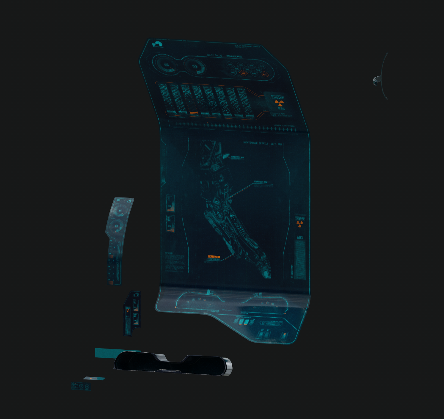
The screen looks interactive. How did you create the animated or dynamic material for the Console’s display in Unreal Engine?
The magic is all done inside the Unreal Material Editor with a special texture. Here is how it is done:
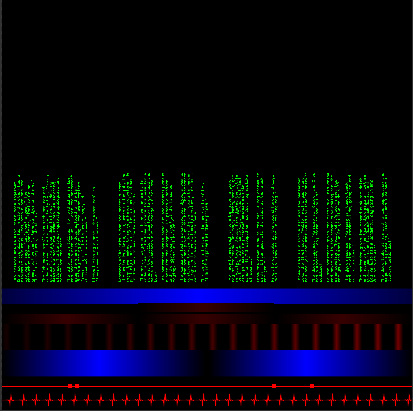
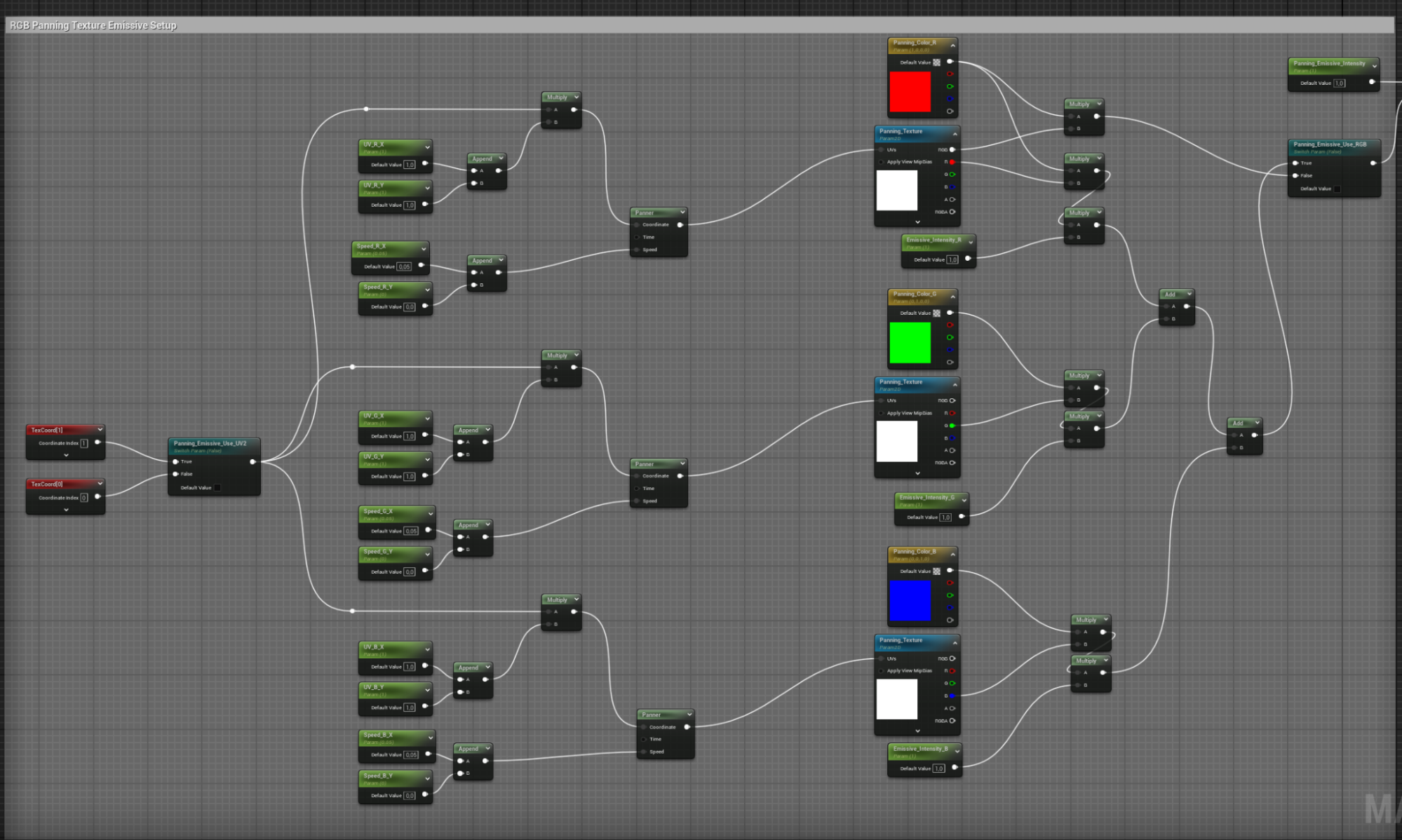
We took our static screen and made a duplicate. From the original version of the texture we removed all the elements that are supposed to be animated - those areas are empty. We duplicated the mesh screen and cut off areas where the animation will be present. Then, we assigned a second screen texture in those areas. Now the second material could be applied to only the animated elements. After that, we created a panner texture. We took the cut off elements and created a second UV channel and mapped islands to the panner texture.
Rest of the magic happens inside the Unreal Material Editor. Panner basically moved the texture and we get the animation visible. We have 3 color channels in the shader editor and 3 color channels in the panner texture. That let us control the speed and direction of the animation of certain elements based on where in the texture the UV islands were mapped. Red ones had fast speed, blue ones medium, and green the slowest.
What software and tools did you use for this project?
To demonstrate the capabilities of Sierra Division to prospective clients, this asset was entirely our own creation, with no external assets or textures used.
The modeling and UV mapping were completed in Blender, using some add-ons to streamline and speed-up the process. Texturing involved both trims and custom textures, achieved in Substance Painter. Final renders were done in Unreal Engine, with additional post-processing in Photoshop.
What was the most challenging part in making this project?
Hard surface design and modeling are always difficult when approaching them in a polygonal way. Doing it in CAD is a lot simpler, but the assets have that very perfect, artificial look, and that’s not how we wanted this asset to appear.
Aside from modeling, I learned quite a few things with this project, such as: 2:1 texturing workflow, incorporating 2D designs from Affinity into Painter, working more inside Unreal since that is not my daily program, making the panner texture and animating the screen, animating the container lock, rendering videos, etc. Most of those things I was doing for the first time, so they were all small challenges! I also had to refresh my graphic design skills, as I hadn't used them in a while. They proved to be very useful when designing the screen and all the animated elements.
This was a very interesting and fun project, and I really appreciate that the Sierra Division gave me extra R&D time to experiment and learn.
If this were a client project, with tight deadlines and strict budget, what advice would you give on how to approach making this as efficiently as possible?
Plan ahead and begin with the end vision in mind. That way, you have a clear goal and a straightforward path to achieving it.
Don’t take shortcuts! Spend proper time researching, making blockouts, and coming up with a story for the prop. This way, you don’t lose time in the process, the end result will be coherent, and design will play well with the storytelling and visual appeal.
Sometimes, when you try to speed things up and take shortcuts, you end up wasting even more time because you have to go back and rethink the process, redo certain sections, or make additional corrections and adjustments.
If you had anything to add to this project what would it be?
I wish I could have more time on it, obviously. There are areas that I'm not 100% happy with—I guess that’s how artists always feel. On the other hand, like I mentioned earlier, having a deadline helped me draw the line. Without a deadline, I would be changing, updating, and modifying bits and pieces for months until I found it to be perfect. The art doesn’t have to be perfect, though. That’s the thing I still struggle with, even after all those years doing CG.
When you look at the end result, you might think, "Oh, this looks dope and nice." The reality is that I struggled with some parts. Even with the modeling, I made mistakes. I even had to redo many elements or re-texture. It has been a bumpy road from blockout to finished product.
If you are a beginner and want to try your chances with design models like this, start small and be prepared for the fact that your first designs will suck. That is always the hard truth; if you embrace it, you won’t be disappointed, and you will have the strength to move forward with your next approach.
Practice a lot, study a lot, be curious. Peace!
Find some of Sebastian's favorite artists and links to their portfolios:
Jan Urschel https://www.artstation.com/janurschel
Vitaly Bulgarov https://www.artstation.com/vbulgarov
Cki Vang https://www.artstation.com/krsld (https://www.instagram.com/vangcki)
Alex Senechal https://www.artstation.com/acms
Andrian Luchian https://www.artstation.com/andrian_luchian
Edon Guraziu https://www.artstation.com/guraziu
Sheng Lam https://www.artstation.com/shenglam
Mathieu Latour-Duhaime https://www.artstation.com/matlat
Chris Doretz https://www.artstation.com/cdodez
Munkhjin Otgonbayar https://www.artstation.com/iif